Every Thursday, I share frameworks to nail your newsletter’s content, growth, or monetisation strategies. On Mondays, I share BTS of our community and micro analysis of newsletters.
If your ICP visits your landing page instead of the subscribe page from your marketing channels, this edition is for you.
Early-stage newsletters make the mistake of not building a dedicated subscription page.
First, Landing pages and Subscribe pages are not the same.
The landing page provides context on everything your newsletter offers and directs visitors to solutions.
Subscribe page shows why your newsletter is worth subscribing to and urges to subcribe asap.
While landing pages focus on branding, positioning, and providing context, subscribe pages focus on conversions.
Today, we will learn the signs of a winning subscribe page by looking at some examples. Based on my 3+ years of studying newsletters.
5 Common Signs of Winning Newsletter Subscribe Pages
1. Non-Generic Benefit:
I am tired of vague, generic benefits that sound like “Your go-to place for NBA interviews.”
Rather have a 2-3 line copy that clearly mentions who the newsletter is for, how it helps them, and why they should subscribe.
In fact, add more direct copy/benefits.
Example: “We interview NBA athletes to show you their mental preparation before games”
2. Humanise CTA:
Simple ‘Subscribe’ CTA works.
But if you can get creative by mentioning the terms only your audience knows, why not? For creator-led newsletters, it could be phrases your audience associates with you.
My friend and I run a newsletter for coffee homebrewers obsessed with good coffee.
Our CTA = "Yes, I hate instant coffee"
3. Add a nudge to the CTA
It’s no secret that a lead magnet improves conversions.
(called magnet for a reason)
Give instant access to resources in the welcome email. Make sure it’s mentioned on the landing page so your reader expects it.
This will encourage your readers to open, click, and spend time consuming your content.
I call this immediate value.
Example: “Sign up and we will immediately send you 10 resources every marketer must read”
4. Do not include the archive page
I had a moral dilemma for the longest time, telling myself, “It’s not right to ask people to subscribe without reading the content first.”
But my perspective changed when I understood what visitors were actually looking for.
It’s not really content, but an assurance that whatever they sign up for is worth their time/email.
So instead of adding an archive page that might disrupt the subscription flow, I’d add:
- Social proof (testimonials, subscriber count, etc.)
- Leverage (show how you’re an expert)
- Immediate value (ebooks, checklists, links, etc.)
- Killer benefits, a call out to ICP, etc., to ensure visitors get the assurance they look for.

Demand Curve = Testimonials
Plus I love how Stacked Marketer calls out their ICP:

5. Image that adds value
Most operators treat images like visual assets. Just to add some colour.
But they can speak a thousand words and show your newsletter’s value. If you don’t have an infographic, a screenshot of your newsletter, or any image that shows why you should be trusted or makes the visitors curious, think twice.
Notice how The Ad Professor shares ads in the background:

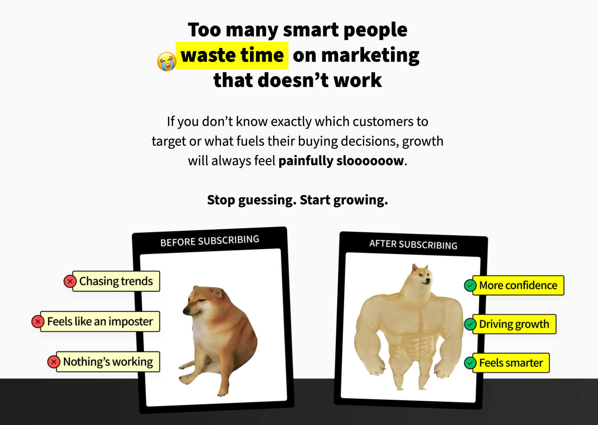
Also I love how Why We Buy newsletter has a graphic explaining how the content transforms you:

Think
If a yes on each question below earns you one point, how many points have you scored?
Do you have a dedicated subscribe page?
Do you have copy that highlights specific benefits to your ICP?
Do you nudge visitors with immediate value?
Is there an image that shows what the inside value would look like?
Is there social proof?
Does it show your leverage?
Does it call out your ICP?
Is your CTA personalised? If it’s just “subscribe”, is it by choice or default?
Send me your score. Feel free to send your subscribe page.
Happy to share thoughts.
PS:
I run a community of newsletter operators. Together, we work on making revenue from our newsletters.
The community is priced at $6 a month, billed quarterly. I am raising the price to $23 per month, effective January 1st.
If you want to lock in the same price forever, now is the time.
Best,
Vikra